TRADING ECONOMICS | QGIS
QGIS is a free, open-source desktop GIS application that lets you load, visualize, edit, and analyze spatial data from virtually any source — files, databases, web services, or live APIs. Download the Long term Release QGIS Desktop 3.40 LTR
Accessing Data In QGIS
Trading Economics exposes its data through the OGC API – Features standard, which QGIS supports natively. There are two ways to connect: browsing all available collections through an OGC connection, or loading a specific filtered dataset directly via URL. Use Method 1 to explore what’s available; use Method 2 when you already know the exact endpoint and filters you need.
Method 1 — OGC API Connection
This creates a persistent connection in QGIS that lists every Trading Economics collection. You can browse, preview, and add layers without memorising endpoint URLs.
- Layer → Add Layer → Add WFS/OGC API – Features Layer…
- Click New and set:
- Name:
Trading Economics GIS - URL:
http://localhost:8080/gis
- Name:
- Click OK → Connect.
- Select a collection from the list → Add.
Method 2 — Vector Layer (direct URL with filters)
Use this when you want to load a specific filtered dataset. You can append any query parameters from the Indicators, Markets, Federal Reserves, or Comtrade endpoint pages directly in the URL.
- Layer → Add Layer → Add Vector Layer…
- Source type: Protocol: HTTP(S), cloud, etc. → Protocol: HTTP/HTTPS/FTP
- Paste the full URL → Add:
http://localhost:8080/gis/collections/indicators/gdp/items?countries=China,Germany
Styling Examples
Once a Trading Economics layer is loaded, QGIS renders it with a default single-colour fill. The sections below show how to turn the raw data into meaningful visualisations
1. Choropleth Map
A choropleth map shades each country or region according to its indicator value, making it easy to spot patterns at a glance — for example, which countries have the highest GDP or the steepest inflation.
- Right-click layer → Properties → Symbology → Graduated
- Set Value to the indicator field (e.g.
gdp_value,inflation_rate_value,bond_yield) - Choose a color ramp (e.g. yellow→red for intensity, green→red for good/bad)
- Set Mode to Natural Breaks (Jenks), choose number of classes → Classify → OK
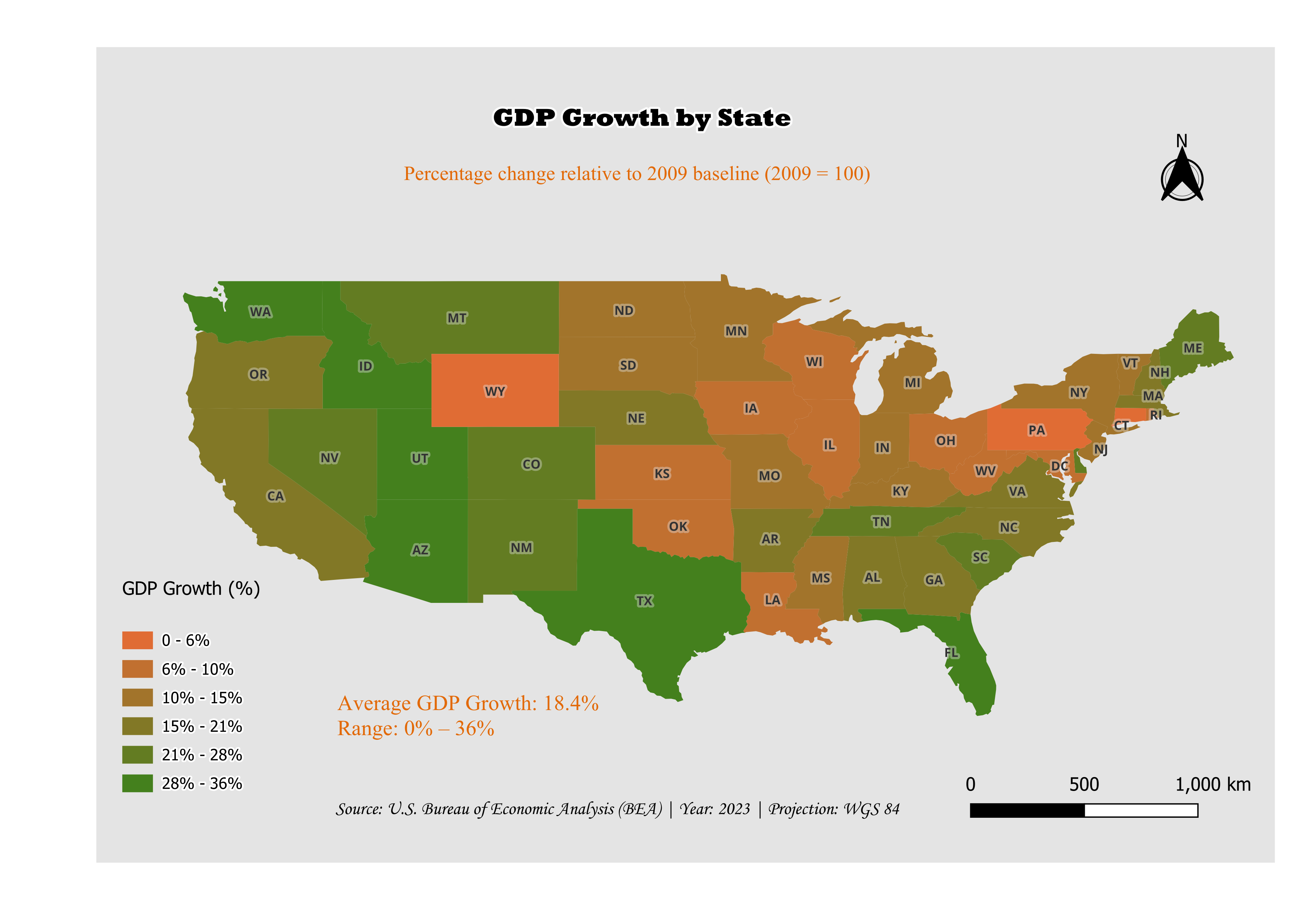
Example Project
The map below was created by loading US state GDP data directly into ArcGIS Pro from the FRED States endpoint and applying a graduated color scheme.
http://localhost:8080/gis/collections/fred/states/indicators/gdp/items
2. Trade Flow Line Width (data-driven)
Comtrade trade-flow layers are rendered as lines connecting exporter and importer countries. Scaling line width by trade value makes major trade corridors stand out immediately.
- Symbology → click the Line symbol → Data defined override next to Stroke width → Assistant…
- Configure:
- Source:
trade_value - Values from: click Fetch value range from layer
- Size from:
0.1to1.5mm - Scale method: Exponential, Exponent:
0.52
- Source:
- Click OK
3. Temporal Animations
Several Trading Economics endpoints support historical ranges via yearFrom and yearTo query parameters. When you load multi-year data, each feature carries a date field that QGIS can use to animate changes over time — watch GDP shift across continents, track rising unemployment, or see trade flows evolve year by year.
http://localhost:8080/gis/collections/indicators/population/items?yearFrom=2015&yearTo=2025
Set up temporal control:
- Right-click layer → Properties → Temporal
- Enable Dynamic Temporal Control
- Set configuration to Single field with Date/Time, field:
date, duration:1 Year - Click OK
Animate:
- View → Panels → Temporal Controller
- Set Start:
2015-01-01, End:2025-12-31, Step:1 Year - Press Play (optionally enable Loop)